A New Project Off to a Strong Start
I've neglected to mention here that I've started a 365 project! Basically, starting on my birthday last week, I have been and will continue to take at least one photo a day that I will post to my 365 site. I suspect there will be some days where I won't have access to a computer to post my photo, but I will at least take the photo and post it as soon as possible afterward. So there will be a photo for each day. I'm going to use it to document a year of my life, to have a longer-term project, and to practice specific photography skills over the course of the year.
Check it out! Year 48 - a 365 photo project
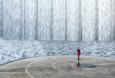
So that's been going on for about a week. Yesterday, I posted the photo above to my 365 site. I'm re-posting it here because this was a particularly gratifying picture for me from a composition standpoint. Here's why I'm jazzed about it:
Check it out! Year 48 - a 365 photo project
So that's been going on for about a week. Yesterday, I posted the photo above to my 365 site. I'm re-posting it here because this was a particularly gratifying picture for me from a composition standpoint. Here's why I'm jazzed about it:
- It's minimalist - This photo is stripped down to bare essentials. The waterwall and the girl. Moreover, the vast majority of real estate is taken up by the waterwall which is basically just a texture; the subject is relatively tiny in the frame. It's also minimalist in color - it's almost monochrome except for the girl's coat. All of this makes the subject pop, despite being so tiny. Minimalism is a look that always resonates with me, but for whatever reason it's not the sort of picture I typically take. I'd definitely like to do it more.
- It exploits a sense of scale - When you see the Waterwall in person, the first thing you're struck by is its enormity. I really tried to leverage that. First, it's framed so you can't see the top, implying that it goes on forever. Second, I wanted a person in the frame so you'd have a sense of just how big this thing is. The fact that it was a small child exagerrated it. And finally, I used a wide angle setting for my focal length and shot from several feet away so the girl would be really small in the frame.
- Rule of thirds - This is a standard rule of thirds shot in terms of where I placed the girl. The structure of the Waterwall lends itself to a balanced and symmetrical shot, but this goes against that natural tendency and I think it benefits greatly from it. If you'd like more information, photographytalk has a nice article on the rule of thirds that goes into more depth.
- Leading lines - The edge of the concrete creates nice curving lines that lead the eyes to the subject.
- Candid - I saw a lot of people posing for shots in front of the wall, but I thought it would be cooler to catch somebody just reacting to the wall naturally. The hard part was waiting patiently until there was only one person in the frame and that person struck an interesting pose. I was lucky that it was a child.

likey
ReplyDelete